le filles

le filles

Thursday, July 29, 2010

Option 3: Anti-Slavery International

Brief

Create awareness and promote Anti-Slavery in the form of a full page newspaper spread to males and females 25+.

SMP: Help stop the trafficking of women

Background: Hundreds of thousands of women are trafficked worldwide each year. Through deception, coercion and the threat or use of violence they are forced into slavery as domestic servants, in sweatshops, and sexual exploitation.
Despite there being victims of a serious human rights abuse, in most countries they are denied the help and protection they need. In many cases, they are deported to the countries and conditions, from which they were trafficked, only to be trafficked again.
Almost every country in affected by this modern-day slave trade - you can help make a difference.The objective is to drive interest to the wider issue as well as to the antislavery website where people can then take the appropriate steps to help.


Research


  • Human trafficking is the illegal trade in human beings for the purposes of commercial sexual exploitation or forced labor: a modern-day form of slavery
  • Every year four million people are trafficked
  • 80% of all trafficked humans are females
  • 50% of all trafficked humans are kids
  • According to UNICEF over 1.2 million minors are being trafficked each year around the world, majority aged 11 to 14.
  • 80% of all trafficked humans are sold as sex slaves
  • A sex slave will be forced to have sex up to 20 times a day, forced to have abortions, and often forced to take drugs to remain complicit.
  • Trafficking has a global annual market of about $42.5 Billion
  • It's the fasted growing criminal industry in the world
  • Trafficking is prominent in the following countries on an astronomical scale: Africa, Canada, US, Colombia, Brazil, Japan, India, Thailand, Iraq, Ukraine, Russia, Moldova, Austria, Belgium, Greece, Germany, Netherlands, Spain, Switzerland, United Kingdom and Australia.


Strangely after flicking on Oprah on the 29th of July 2010 they had a journalist who was raising awareness on Human Trafficking. Here is a part of the show that was of interest telling the story of a young Cambodian girl and her experiences as a sex slave. (Narrated by Angelina Jolie). As we were not fully aware of this issue we thought that we would show this for everyone to achieve an insight into Human trafficking.


The well known movie Taken staring Liam Neeson portrays a story of Human Trafficking. Neeson plays a former Central Intelligence Agency paramilitary operative who sets about tracking down his teenage daughter after she is kidnapped by Albanian slave traders while traveling in France.


Awareness through print

A common way that is used to create awareness is through powerful imagery that strikes an emotive response.


Through extensive research we found that most awareness raising documents projected dramatic imagery to get the point across.

The following is a moving commercial to create awareness and try to put an end to human trafficking and slavery.


Concept

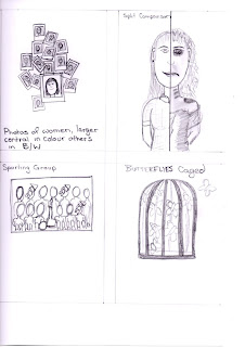
Our initial ideas were sparked from what we believed was representational of freedom including doves, butterflies being caged. These would represent the humans who live in the world and have the right for freedom but are trapped like animals in cages.


After discussing this initial idea we thought that this approach may not have a strong enough impact on the Australian public. People would have a stronger reaction if there were images of people in the anti slavery ad as they can relate more. Deciding to try and appeal to the public creating an emotional response was the new angle we went with.


We came up with three other ideas which would work. The first was the idea of using Polaroids, each displaying a photo of a woman. There were to be two or three that would be blank representing the ones that had been kidnapped or sold. The second idea was to be a comparison. Half of the girls face happy and dressed well enjoying life, the other half dark gloomy, beaten and sad to showing the repercussions and effects of slavery. The third was to appeal to the typical australian with a sporting team or group photo with a few females with sold stamped across their faces.


Sketches of ideas


Not being able to decide what one we would go with we decided to make mock ups of the three.

Variations of Idea #1

In this idea it was decided to include alarming facts with the imagery to make the audience more aware of the issue. The sold and for sale signs stamped all over the girls in the second variation seems to communicate a worthlessness of these human beings being sold, most people forget these are people just like us.


Idea #2

The second mock up focuses mainly on the sex slave aspect of slavery. It shows a comparison between the normal day of a young girl to that of a sex slave. The text accompanies the image to make the statement stronger. By giving the girls names it gives them an identity and makes the veiwer think of thier own dauthers, neices etc. Facts are included in a small blurb under the image and finishes with "you can help save Anna and other girls like her" in an effort to get the viewer to actually go to the website and help.


Variations of idea #3

The third mock up was to create an appeal and to co inside with Australias love of sport. This brings the big picture into reality by showing three out of ten girls are sold into slavery. It could happen to anyone, three of the ten people you play in a team with could be sold into slavery at any time.


Chosen Idea

Out of the three we decided to go with our first idea as we believed it had a greater mass appeal. The every day snaps make the image feel like it is common and creates the feeling of it could be anyone anytime anywhere that will be sold, people you know and love. The blank polaroids suggest that once they are sold they are gone and will never be the same person again, you will never know that person again. The strong text accompanies the idea displayed with imagery to make an even bigger dramatic impact. We believe the viewer is drawn in by the imagery and is compelled to read the text and this is why it works.


Saturday, July 24, 2010

Option 4: Sensa Pens Print Campaign

Brief

Create a print campaign (minimum 3 ads) targeting a large demographic of Males and Females 15-40 years old.

SMP: You can write anywhere with the Sensa Pen

Background: The Sensa Pen has a precision alloy barrel and plasmium grip to allow you to write underwater, upside down, over any material (wood, metal etc) and over photographs.


Research

We found it extremely difficult to find much research on the actual product possibly due to the fact that they are a discontinued product.

Sensa Pens are known for their ergonomic design and adaptive grip and are part of the Sanford writing products company. Sanford also produces products such as Paper Mate and Sharpie. Sanford became a major force in office products when, in 2000, Gillette sold its writing instruments division to Newell Rubbermaid, whose own stationery division, Sanford, became Sanford, L.P. Gillette had acquired Parker Pens in 1993 and had already owned the Paper Mate brand, as well as Waterman and Liquid Paper. This, along with other acquisitions, made Sanford the largest writing products manufacturer in the world.

The Sensa pen was produced in 1985 and its main factor at first was to reduce the stresses of long writing periods. After ten years of trials and prototypes the Sensa pen was introduced as a radical design which was intended to take consumer use of writing instruments to the next level. There was positive feedback because due to the pens grip being made with plasmium fluid, stress of writing was reportedly reduced by 50%. The Pen also can be bought as a combo in which the tip of the pen not used for writing can actually be used on any PDA or writing computer gadgets. The Pen also came out with various collections to draw in different target markets such as students or business professionals.


This ballpoint pen features a special pressurised Sensa Pen refill, and this is what allows the user to write virtually anywhere from upside to underwater. There was even a Sensa pen that wrote ultra violet, therefore being able to be used under black lighting.

Source http://en.wikipedia.org/wiki/Sanford_(writing_products)


Target Market

The target market communicated was a pressing factor in the angle we would go with Sensa Pens. Due to the large target market Sensa Pens are required to appeal to a wide demographic. We decided to try and cover most ages within four advertisements with each advertisement appealing to varied groups.

Product


Past Print Ads for Sensa Pens

This focused on the grip of the Sensa Pens


Print Ads for other pens

As there were hardly any print ads for Sensa Pens we decided to look at other pens on the market which would target similar target markets to the Sensa Pen. We decided to look at the main competition of Sensa Pens being Bic and Sharpie.


Bic Ads

There were many print ads targeting varied audiences by Bic. We found these to be creative, interesting and appealing to different demographics. The 'More joy of writing" campaign was of particular interest because of the simplistic angle that was utilised.


The following targeted teens saying that if you take the wrong pen into exams (pens that are not Bic pens) you will fail in life.


Sharpie Ads

Sharpie Markers utilise celebrity endorsements (David Beckham) to create popularity throughout their campaign. They focused on the idea of signing autographs.


They also created the following TV commercial for the campaign.


Other Sharpie Ads and Commericals


Other research showcasing the clever use of pens/pencils

Aha - Take on me


Big Bang Theory


Incubus - Drive


Concept

We liked what concepts the leading competition was utilising in advertising campaign but we wanted to more directly coincide with the SMP. Demonstrating that Sensa Pens could write on varying surfaces and in different situations was the main concept we wanted to explore.

Inspired by the water resistant pilot pen advertisement and it's ability to write on unusual surfaces, we came up with several ideas.


Our original ideas consisted of varied scenarios where the Sensa Pen is being used where you would not be able to use a normal pen.
These included displaying the pen being used to create a tattoo, being used by a rock climber on a cliff to write "I was here", used by a toddler to draw not only on the wall but all over the room including on the ever attentive snoozing father, writing on a homing pigeon instead of on a letter attached to its foot, writing reminders on clothing and writing under water.

Rough sketches


Although we realise these pens can be used anywhere, some situations we first came up for the ads with were a bit ridiculous and wouldn`t happen in reality. We decided that if we had the Sensa Pens being used in more common situations it might better appeal to the consumer. We decided upon scenarios that could happen any day, or anywhere a person might think, I wish I had a Pen right now! Our goal is to make the consumer think of their Sensa Pen in those situations and say "I wish I had my Sensa Pen right now" ultimately creating more of an urge to buy the pen.


Chosen Idea

We toned down our original ideas and came up with the chosen four new ones we used in the final product.

We came up with the idea of needing a pen to write down an idea or thought when you usually are unable to. Tying this in with an every day activity we came up with when you are having a bath. This is when lots of people are relaxed and thoughts or ideas flood into heads. We decided to project this through a female writing about her day but instead of using a diary using the side of the bath, only being able to do so with a Sensa Pen. 


Sketch of idea #1


The second idea  portrays a young person out at a club. Everyone at some stage has been out and heard a song they absolutely love, not knowing the name of the song there is an urge to some how write down the lyrics so you can look up the song later. We came up with young person writing down the lyrics on a wine/cocktail glass, only achievable with a Sensa Pen.


Sketch of idea #2


With the third idea we aimed to appeal to older demographics.  Showing a P plate driver parked and talking to friends in the distant with the back P plate on the car being damaged and only half visable. The older person grabs thier sensa Pen and re draws the rest of the P plate on to stop the P plater from receiving a fine from police for not correctly displaying p plates, once again only achievable with a Sensa Pen.


Sketch of idea #3


Our fourth and final idea was based around the fact that sometimes you don't have time to scrounge around for a piece of paper when you need to write something down. Generally you will lose the piece of paper anyway. We thought of recipes which with the craze of cooking television shows at the moment would have mass appeal. Everyone has gotten recipes and lost them also. We came up with the idea of a woman on the phone to her grandmother (as we all know grand mothers are amazing cooks and have the best old recipes) jotting down a recipe on a chopping board, being only able to do so with a Sensa Pen.

Sketch of idea #4


Each image was set up and photographed.


Final Mock Ups

With the final images we collaboratively decided that each would be more punchier with their own image supporting tagline with the words 'reach for your Sensa Pen' being a constant in each.

Advertisement #1  : Record the good times - reach for your Sensa Pen


Advertisement #2 : Don't forget the lyrics - reach for your Sensa Pen


Advertisement #3 : Do a good deed - reach for your Sensa Pen


Advertisement #4 : Need that recipe? Call Nan - reach for your Sensa Pen

Thursday, July 15, 2010

Option 1: Toyota Prius Billboard

Brief

Create a 24 sheet billboard which targets Male and Female drivers who have or believe they have a social conscience.

SMP: "Prius is the most environmentally friendly car in Australia."The Toyota Prius has a high-tech hybrid engine which uses up to 50% less fuel and generates up to 80% less emissions. Yet it still performs as well as a normal car.


Research

Background information

The Toyota Prius is environmentally friendly, which is the car’s main selling feature. It is fuel efficient to the last drop, and designed with power and performance in mind. The Prius is cleaner; more efficient, and therefore Australians can leave a smaller global footprint. “Drivers want fun and versatile vehicles that deliver more power, less fuel, and no compromise. The Toyota Prius and Yaris are two vehicles that have repeatedly demonstrated their abilities to do that” – Toyota.


What kinds of people buy the Toyota Prius?

Often people with higher income levels of above $100,000 will buy the Toyota Prius, and the main reason they select it is because what it says about them. People want to be seen as being more ‘green’ or ‘eco-friendly,’ therefore since that is what the Toyota Prius is all about it becomes the ideal car to select. “They want the image the Prius cultivates--technically advanced, thrifty, green--rather than the amenities of a more conventional luxury brand.”


Source
http://www.greencarreports.com/blog/1044525_buying-a-green-car-its-all-about-being-seen-being-green
http://www.toyota.com.au/prius


Previous Toyota Prius Print Advertisements

The following  three advertisements were fitted with the tagline "Well at least he/she drives a Prius."

This campaign was not an official company ad of Toyota but rather the work of an unknown Art Director seeking a change from the stereotypical "holier-than-thou" Prius driver image. In each of the three ads, driving the Hybrid vehicle is the only honorable thing the driver is doing. The first showing the driver commiting adultery, the second desposing of a body and the third delving into prostitution, but all that is ok because.....they drive a Prius!


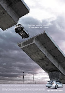
Other Print Advertisements explored by Toyota include the following which focus directly on the economic efficiency of the vehicle. In the first ad they explore the aspect of who needs petrol for power in a visual demonstrating benefits and challenging perceptions that the electric driven Prius does not have the power of that of petrol-driven cars. This advertisement strategically uses appraisal to inform readers that the Prius can still be good for the environment without compromising on performance.

The second ad demonstrates the fuel efficiency of the Prius. The idea was to show these gas pumps as if they where being interviewed demonstrating the fact that there was less need to refuel.


Toyota has also experimented with other forms of advertisement for the Prius:

Fuel Pump Tags


iPhone Application


Toyota have also released a new iPhone app that attempts to educate as well as advertise the features of the Prius car. It's main feature includes a Draw feature allowing you and your iPhone to interact with a large screen over in Times Square New York. When you have downloaded the application you load it up and draw on the screen. Your drawings are then thrown up on to the huge screen and mixed with the Prius. Other features of the Prius iPhone App include 360 degree views of the interior and exterior of the car along with interaction with the camera on the phone as well as a 10 level game.


Previous Toyota Prius Billboards


Other Toyota Billboards of interest


General Billboards of interest


We wanted to achieve a unique style of billboard which differed from what Toyota has previously explored. Here are some which we liked.


Previous Toyota Prius Television Advertisement


Concept

Throughout our very first meeting/group discussion we primarily began thinking about the  environmental aspect of the Toyota Prius. We discussed colours as a basis of ideas for the environmental factor with colours of interest being of shades of green which is nastalgically represents this. Other colours included white for its crisp, clean and fresh notions and bright blues representing clear skies and cleanliness.

From this stemmed the idea of a contrast between the Prius and a non hybrid car showing the difference between the Prius compared to other pollutant vehicles. We came up with the idea of a divided page with half the car representing non hybrid vehicles and the front half representing the Prius. The back half would be in a smoggy, polluted, scenery with little life and the front of the car would be in an area that is clean, green and with large amounts of life.

We experimented with various ways we could go with this idea.


We concluded that the idea was usable but contained similar components of the ads already utilised by Toyota. We wanted something new, more simple and that had a more stylised angle. This idea was abandoned as other ideas progressed.


Other ideas we came up with were included the following:


The country scape being pulled along by the Prius.
We then came up with the idea of Prius creating a path of environmental growth as it zooms along the desolated road. It projects nature returning through the cracks in the wake of the Prius. We were happy with this angle also but wanted a more clean, simple, resolved design that was clever.

Mock Up


Chosen Idea

Our chosen idea was based on a billboard we found for Koleston natural hair colourant. It fit well with the idea of the Prius being environmental and at one with nature.


Sketches


Experimentation


Final Mock Ups

 The prius image is die-cut in the billboard to capture the varying ambiant colours of nature through the different phases of the day and night. The billboards will be stategically placed in various natural environments as demonstrated below. Each billboard will have solar powered lighting so as the day draws to an end it will still be visable. We aimed at drawing people in with a clean, minimalistic and clever solution that is aestheically pleasing and environmentally inclusive. You can't get much closer to nature than nature itself.